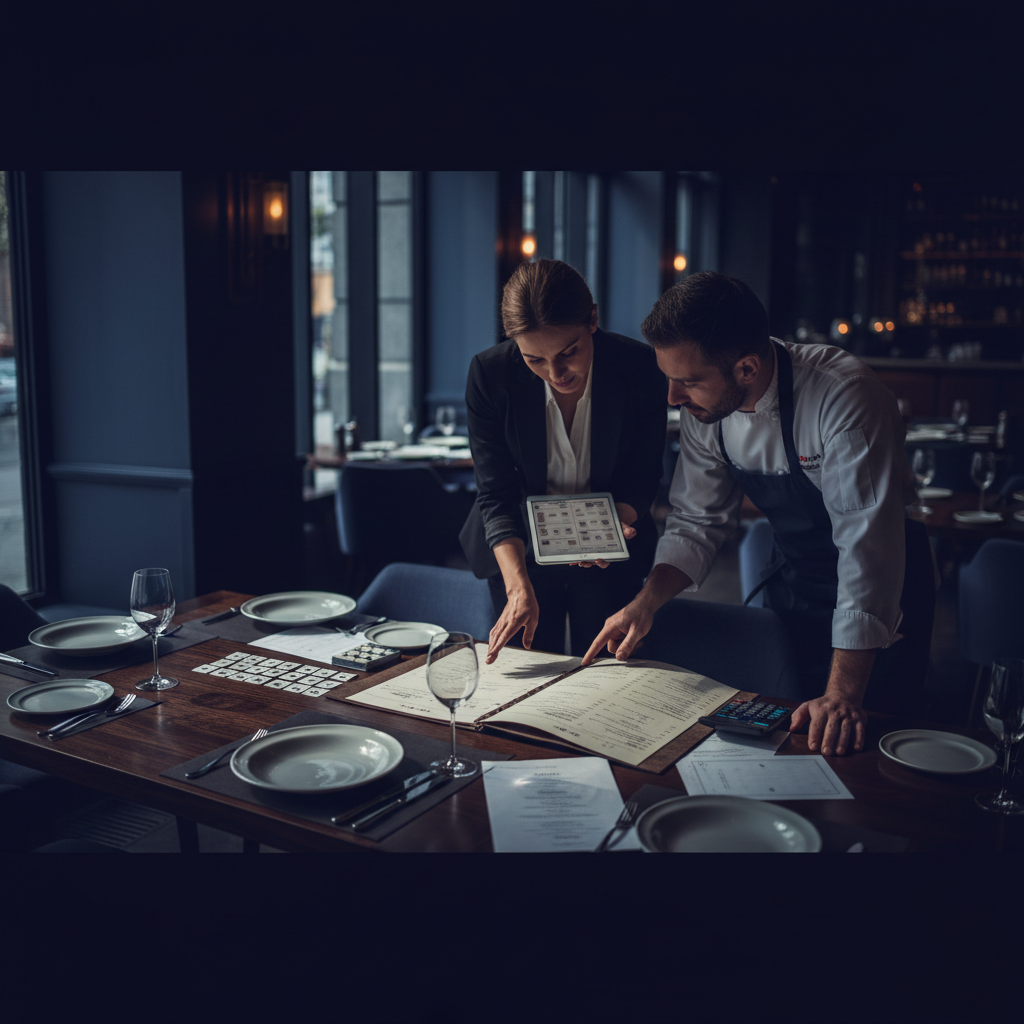
How to Design a Restaurant Menu That Sells More Dishes
Your menu is your most powerful sales tool. Unlike a server recommendation or a specials board, your menu reaches every customer at the moment they're making purchase decisions — and the design choices you make have measurable impact on what they order and how much they spend.
Build your digital or QR menu in minutes
Try our Free AI Menu Builder for RestaurantsMenu engineering — the discipline of designing menus to maximize both customer satisfaction and profitability — has generated substantial research over the past few decades. The principles are clear, practical, and applicable regardless of whether you're using a free menu creator or working with a professional designer.
The Psychology of Menu Reading
Want a digital menu with QR code for your restaurant? Build your free digital menu — Create a QR menu in minutes — update it anytime, no printing required.
Customers don't read menus the way they read a newspaper — they scan. Eye-tracking research shows predictable patterns in how customers navigate a menu:
- Two-panel menus: Customers look at the center first, then move to the top-right, then the top-left. The "sweet spot" on a two-panel menu is the top-right panel — ideal placement for your highest-margin dishes.
- Single-page menus: Eyes typically start at the top center and move clockwise. Top and center positions get the most attention.
- Category scanning: Within categories, customers pay most attention to the first and last items listed.
Understanding these patterns means you can deliberately position your highest-margin and most-promoted items in the areas where customer attention is naturally highest.
Layout Principles That Drive Sales
Use boxes and visual hierarchy to guide attention
Items set apart in a box, with a different background color, or accompanied by a photo receive disproportionate attention. This is a well-established menu design technique: use visual differentiation to highlight items you want to sell. The items you select for this treatment should be high-margin, high-popularity items — your "stars."
Limit category size to reduce decision paralysis
Behavioral economics research (the "paradox of choice") shows that more options often lead to less satisfaction and slower decisions. Restaurant menus with 7 or fewer items per category outperform longer lists on both customer satisfaction and order efficiency. Ruthless editing — removing slow-moving, low-margin items — typically improves both operations and customer experience.
Use white space intentionally
A cluttered menu signals value (lots of options for the price); a menu with generous white space signals quality (carefully curated, premium positioning). Neither is wrong — they communicate different things. Match your white space strategy to your restaurant's price positioning and customer expectations.
Anchor pricing strategically
The most expensive item on a menu — even if rarely ordered — makes all other items seem more reasonable by comparison. Place a premium item prominently and price other items relative to it. This "price anchor" effect reliably shifts customer spending upward.
Typography and Readability
Menu typography is often overlooked but significantly affects both readability and brand perception:
- Body text size: The minimum readable size for menu body text is 9pt — 10-11pt is more comfortable. Test at actual print size, not on screen.
- Contrast: Black or dark gray text on white or light backgrounds provides the best readability. Artistic font choices that reduce contrast look interesting in design software but become frustrating in a restaurant's actual lighting conditions.
- Font pairing: Use a maximum of two fonts — typically a display font for category headers and a clean body font for item names, descriptions, and prices. More fonts create visual noise without adding value.
- Alignment: Consistent alignment throughout the menu (all prices right-aligned, all item names left-aligned) makes the menu easier to scan and looks more professional.
Writing Descriptions That Sell
Menu copy has a direct relationship with order frequency. Items with evocative, sensory descriptions consistently outsell identically-priced items with generic names. Research by menu engineer Gregg Rapp found that descriptions containing sensory language ("crispy," "slow-roasted," "house-made") increased sales of those items by up to 27%.
Effective description principles:
- Lead with the most evocative element ("House-made tagliatelle" beats "Pasta")
- Mention preparation methods that signal quality ("slow-braised," "wood-fired," "hand-rolled")
- Reference ingredient provenance where it's genuine ("Faroe Island salmon," "local heritage farms")
- Keep descriptions to 2-3 lines — longer descriptions slow reading and add visual clutter
Pricing Presentation
Several evidence-based pricing presentation techniques reduce price sensitivity:
- Remove dollar signs: Writing "16" instead of "$16.00" reduces the psychological "pain of paying" associated with prices.
- Avoid aligned price columns: Menus where prices form a neat right-aligned column train customers to scan prices and choose by cost. Embedding prices naturally at the end of descriptions ("...roasted fingerlings, 24") integrates cost into the full item context.
- Round prices strategically: ".99" pricing reads as discount/value-oriented. Round numbers (24, 18, 36) read as confident and quality-oriented. Match your pricing format to your restaurant's positioning.
Photography: When to Use It and When Not To
Food photography can increase orders of photographed items by up to 30%, but only when the photography quality is high. Poor food photography is worse than no photography — it raises quality expectations the reality can't meet and undermines the overall design.
For restaurants with professional food photography: use 1-2 photos per page, featuring high-margin or signature dishes. Position photos to draw the eye toward the items you want to highlight.
For restaurants without professional photography: skip photos entirely. A clean, well-designed typographic menu consistently outperforms a design cluttered with mediocre food images.
Create your menu now — free, no design skills needed
Try our Free AI Menu Builder for RestaurantsTesting Your Menu Design
The ultimate test of a menu design is whether it drives the ordering behavior you want. Track these metrics before and after a menu redesign:
- Average check size
- Mix of high-margin vs low-margin items ordered
- Attachment rate (desserts, sides, premium upgrades ordered per table)
Menu design improvements that work in research don't always translate identically to every restaurant context. A/B testing menu variations — even informally, by tracking orders during different service periods with different menu layouts — generates real data about what works for your specific customer base.
What Makes a Restaurant Menu Effective
A well-designed restaurant menu does far more than list what's available. It guides guest decisions, communicates your brand's personality, highlights your most profitable dishes, and sets expectations for the dining experience before the first bite arrives. Poor menu design, on the other hand, overwhelms guests with too many options, buries your best dishes, and trains customers to hunt for the cheapest item on the page.
Understanding a few core principles of menu design can meaningfully increase your average check and guest satisfaction — without changing a single recipe.
Menu Engineering: The Science Behind the Layout
Menu engineering is the practice of strategically positioning and presenting menu items to maximize profitability. The core framework categorizes every item into one of four quadrants based on popularity and margin:
- Stars (high popularity, high margin): These are your best items. Give them prime placement — the upper right of a two-page spread, the top of a category, or a visual callout box. Don't hide them.
- Plowhorses (high popularity, low margin): Guests love these but they don't make you much money. Consider raising the price slightly, reducing the portion, or repositioning them lower on the menu.
- Puzzles (low popularity, high margin): These are worth investing in. Better photography, more compelling descriptions, or placement near popular items can bring these dishes to life.
- Dogs (low popularity, low margin): Consider removing these. Menu bloat hurts the guest experience and ties up prep resources on items that don't earn their keep.
How to Write Menu Descriptions That Sell
The words on your menu work hard — or they don't. A flat description like "Grilled salmon with vegetables" does nothing to build appetite or justify the price point. A well-written description like "Atlantic salmon, grilled over hardwood, served with roasted seasonal vegetables and a lemon-herb butter sauce" is specific, sensory, and earns the price.
Tips for better menu copy:
- Use origin words: "house-made," "locally sourced," "slow-roasted," "wood-fired"
- Invoke senses: describe textures, temperatures, and aromas
- Be specific about preparation: "pan-seared" is more evocative than "cooked"
- Keep it concise: two to three compelling sentences is better than a long paragraph
- Avoid generic words: "delicious," "amazing," and "popular" add nothing
Digital vs. Printed Menus: Which Is Right for Your Restaurant
Printed menus offer a tactile, curated experience — particularly valuable in fine dining. But they're expensive to update, can't be changed in real time, and don't collect any data. Digital menus, whether accessed via QR code, tablet, or online, solve all of those problems. Most restaurants today use a combination: printed menus for a premium feel with QR codes for accessibility, real-time specials, and loyalty integration.
For restaurants using Loop.fans, digital menus provide a natural touchpoint for loyalty enrollment. When guests access your menu digitally, you can prompt them to join your rewards program, earning points for their visit and any content they share about their experience.
Free Menu Tools vs. Paid: What You Actually Get
Many free menu creation tools exist, including Canva, Adobe Express, and dedicated restaurant menu builders. For basic designs, free tools are genuinely useful. Where they fall short:
- Limited customization options beyond templates
- No real-time updating capability for digital menus
- No integration with your POS, ordering system, or loyalty program
- Branding restrictions (watermarks, platform logos)
- No analytics on what guests are viewing
For restaurants serious about using their menu as a business tool, a paid platform with real-time editing, analytics, and integration capabilities pays for itself quickly.
Ready to build your digital menu?
Try our Free AI Menu Builder for RestaurantsFrequently Asked Questions About Restaurant Menus
How many items should a restaurant menu have?
Research consistently shows that menus with fewer, well-described options outperform menus with many choices. The "paradox of choice" applies: too many options leads to decision fatigue and lower satisfaction. Most consultants recommend 7 items or fewer per category as a starting point.
How often should I update my menu?
Seasonal updates (quarterly) keep your menu fresh and allow you to capitalize on ingredient availability and pricing. More frequent micro-updates — removing sold-out items, adding specials — should happen in real time, which is why digital menus are so valuable.
What's the best format for a small restaurant menu?
For small restaurants, a single-page or two-page menu typically works best. It forces discipline in item selection and makes the guest experience easier. A digital version of the same menu gives you flexibility to add specials, rotate items seasonally, and update prices without reprinting.
Also on Loop.fans: Build your restaurant's online presence with our AI website builder for restaurants — includes CRM, loyalty, and online booking in one place.
Getting the most out of how to design restaurant menu that sells more: advanced tips and next steps
Use data to refine continuously
Track which menu items generate the most revenue per square foot of prep space, not just which sell the most units. High-margin, low-effort items deserve prominent placement; low-margin, high-complexity items should be reviewed regularly.
Connect menu strategy to loyalty
Your best-selling items are your loyalty program's best promotional tools. Offering a free version of your most popular dish as a reward drives redemptions, visibility, and word-of-mouth far more effectively than a generic discount.
Test incrementally, not all at once
Menu changes are experiments. Change one section at a time, give it 4–6 weeks, and measure the impact on total covers, spend per head, and reorder rate before making the next change.
Optimize for operational rhythm
The best menus are designed with kitchen flow in mind. Items that share prep components, cooking methods, or timing reduce service friction and improve consistency — especially during peak hours.
Ready to get started?
Launch your free digital loyalty card — No app download required for customers. Set up in 10 minutes.